About the Project
To see the site, click here or on the image!
Roles
Front-end developer | UX/UI Designer
Tools
Atom | Git
To see the site, click here or on the image!
Roles
Front-end developer | UX/UI Designer
Tools
Atom | Git
Process
1) Gather copy
2) Create “Home”, “About”, and “Project” HTML page
3) Link the HTML sites together
4) Add CSS for styling/animation
5) Add JavaScript to the site
6) Usability Test
7) Code cleanup & accessibility
8) Cross-browser testing
Usability Testing
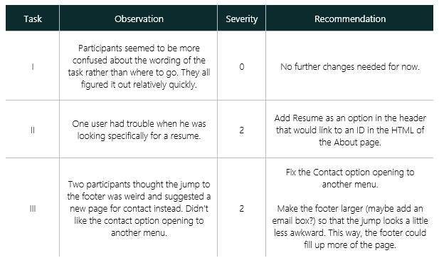
To figure out what I needed to improve on, I conducted a usability test with five participants and three tasks:
- Where do you think you can go to see more information on a project and thought processes?
- Where can you find my resume?
- Where can you go to reach out?
The chart below shows my results from testing.
Severity rating is based off of Jakob Neilson’s usability scale:
-
0: I don’t agree that this is a usability problem at all
-
1: Cosmetic problem only: need not be fixed unless extra time is available on project
-
2: Minor usability problem: fixing this should be given low priority
-
3: Major usability problem: important to fix, so should be given high priority
-
4: Usability catastrophe: imperative to fix this before product can be released
Code Cleanup & Accessibility
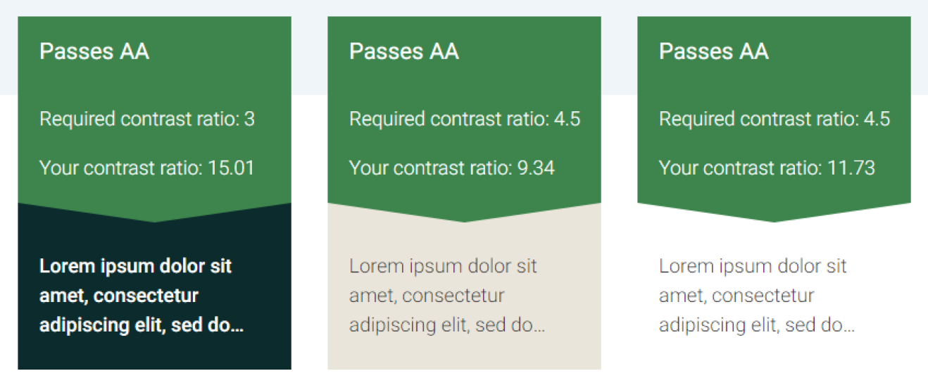
For accessibility, three text/background color combinations were used, and all passed AA accessibility grade according to https://accessible-colors.com/.
Cross-Browser Testing
Site was tested on the following browsers via Desktop (24”):
- Google Chrome Version 85.0.4183.83
- Mozilla Firefox Version 79.0
- Microsoft Edge Version 85.0.564.44
Via Macbook (16”):
- Safari Version 13.1.2
Viewports tested:
- Mobile
- Tablet
- Desktop
Thoughts
What was learned?
I’ve had to touch HTML/CSS/JS code here and there throughout the years, but never knew how to fully integrate them. This project helped to hone my skills in the front-end development side of things, and I had a lot of fun in the process.
As a final note, I took some suggestions and resolutions from my usability testing and implemented them here on my current portfolio site!


