About the Project
Flipnote was created during my UX Fundamentals course at CareerFoundry as a fun, creative way to study new vocabulary. It provides visual/textual learning features like the ability to doodle on flashcards, import photos, and add custom hints. It aims to offer many intuitive features to help exercise newfound vocabulary.
Role
UX Researcher | UX/UI Designer
Tools Used
Prott | Cacoo
Empathizing
1
Empathizing
1
Problem Statement
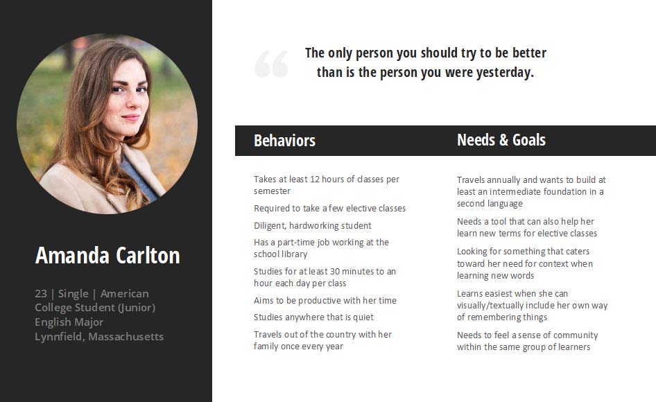
People need an intuitive, motivating tool to remember new vocabulary/languages because they are studying in school, travelling the world, or wanting to expand their knowledge.
hmm…
Potential solution for this?
By creating a focus-themed, visually appealing flashcard app with unique features, we will achieve a learning community of users alike who are able to maintain knowledge comprehension.
Defining
2
Defining
2
User Research
I wanted to know what potential users were looking for in a vocabulary app, so I set out to conduct four user interviews with the following goals in mind:
- Identify what makes learning new vocabulary difficult for people
- Collect information on what helps people remember vocabulary
- Determine what existing tools people like to use for studying
Analysis
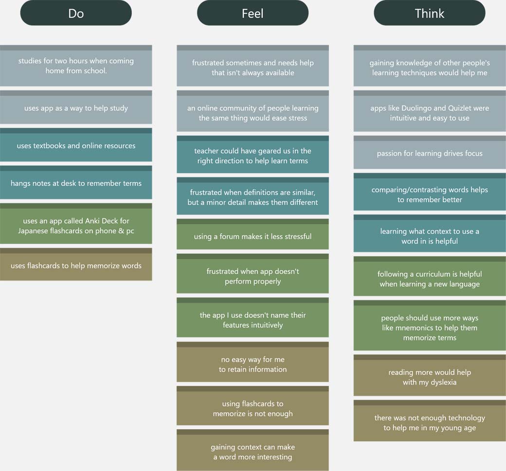
From analyzing my results from the interviews, I was able to discern three categories of what my potential users do, feel, and think.
Ideating
3
Ideating
3
User flows
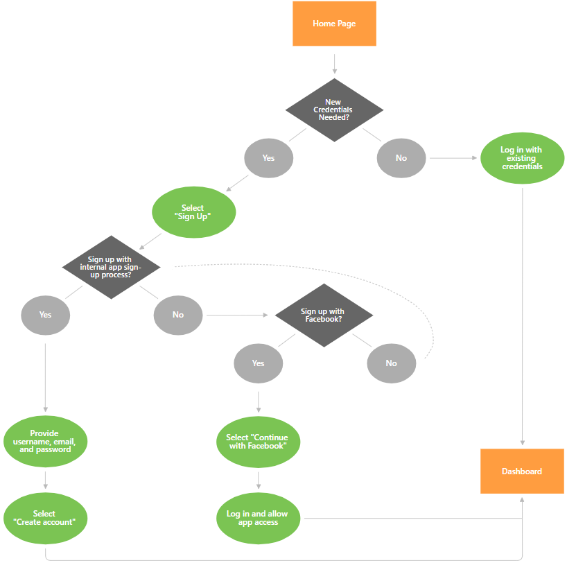
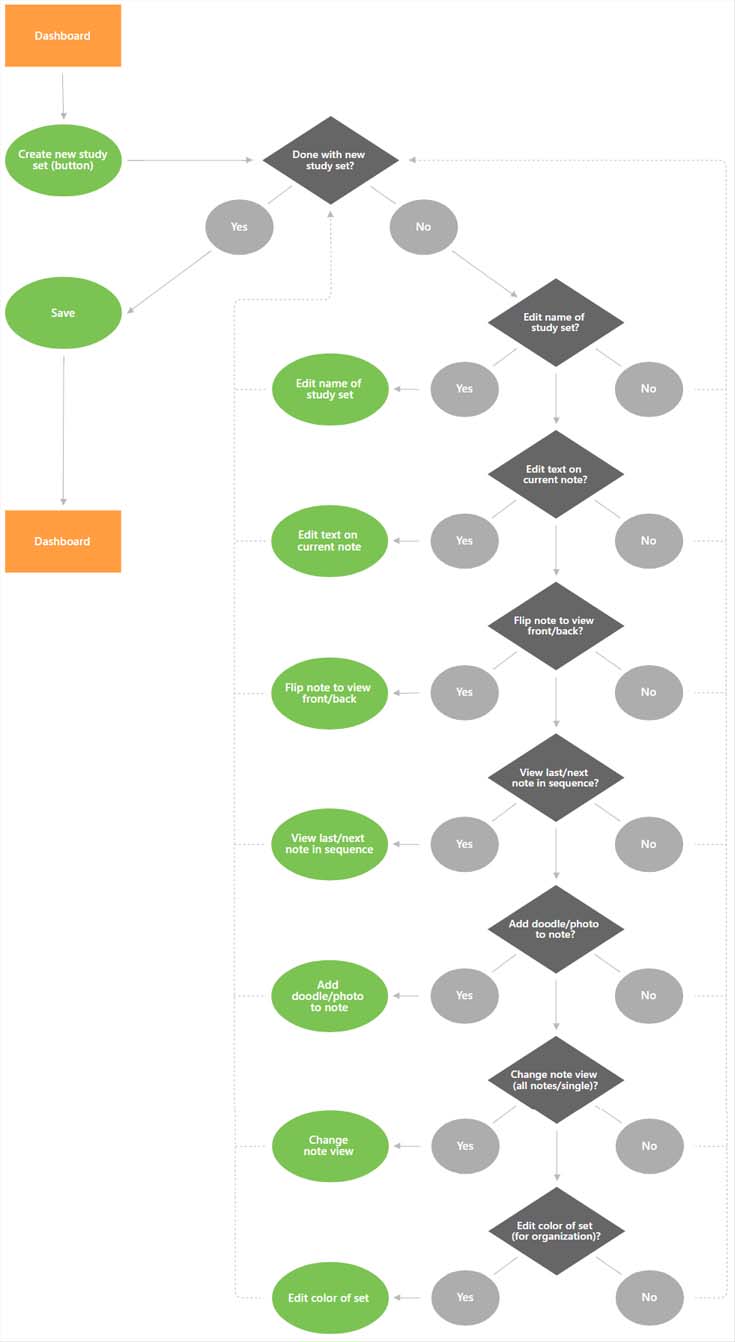
I created two user flows based on two important tasks in the app:
Prototyping
4
Prototyping
4
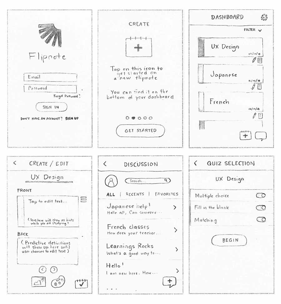
Now I was ready to wireframe and prototype to prepare for user testing. My screens consisted of the following:
- Splash
- Onboarding
- Create/Edit
- Study
- Quiz
- Discussion
- Settings
Testing
5
Testing
5
Tasks
I chose tasks that would be considered main features that the app has to offer. This way, I would pick up any errors on basic functionality.
I wrote a script and planned for my users to try some scenario tasks—here they are translated into direct tasks:
1) Create a new flipnote (study set) with a doodle
2) Post a new topic on to the discussion board
3) Write a reply on the discussion board
4) Finish taking a quiz
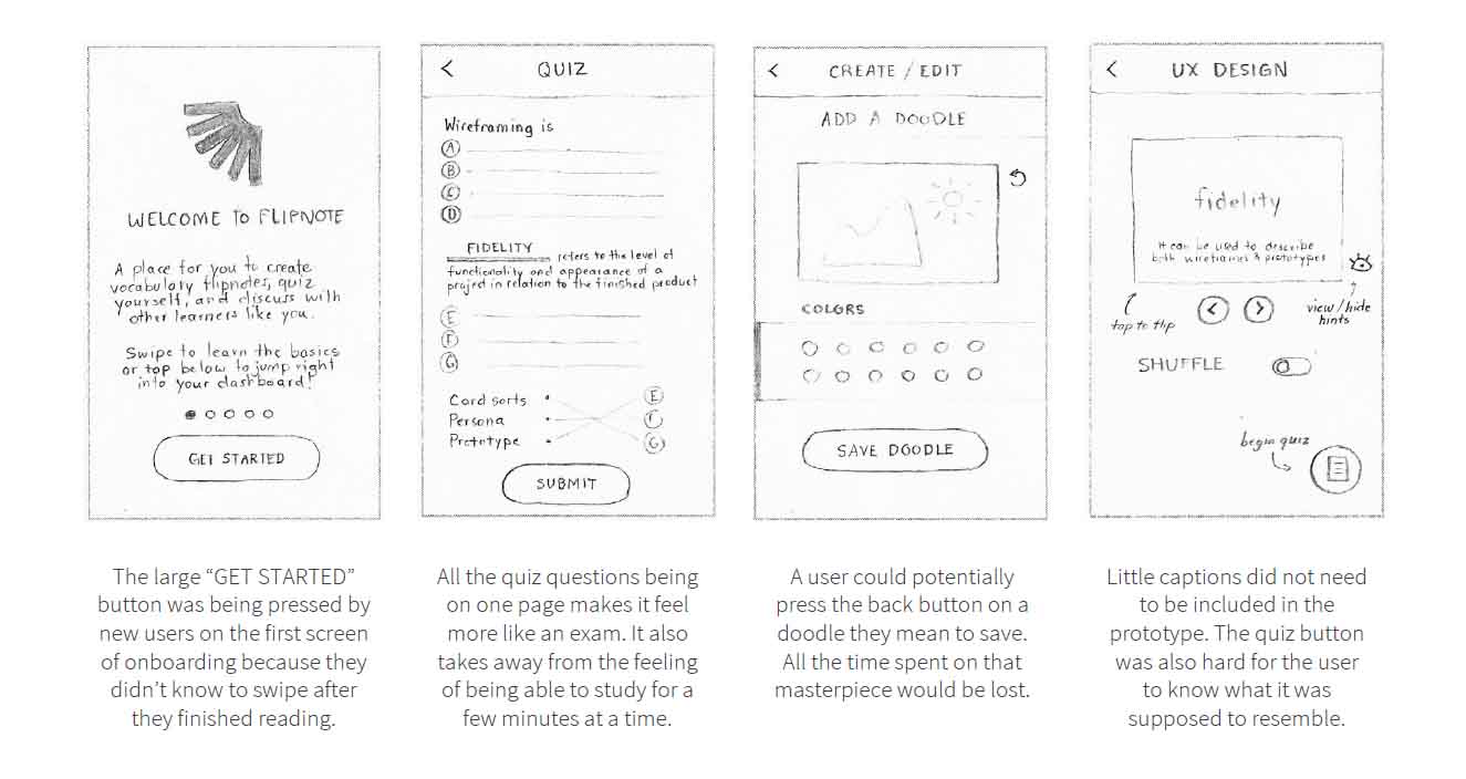
Results
Severity rating is based off of Jakob Neilson’s usability scale:
-
0: I don’t agree that this is a usability problem at all
-
1: Cosmetic problem only: need not be fixed unless extra time is available on project
-
2: Minor usability problem: fixing this should be given low priority
-
3: Major usability problem: important to fix, so should be given high priority
-
4: Usability catastrophe: imperative to fix this before product can be released
Interactive Prototype
Click here to see it in action!
Thoughts
What was learned?
- Analyzing competitors and reading feedback from users is extremely helpful
- Personas should reflect what was found in user research
- Information architecture should tie in with what’s going to be user tested
- User testing is essential for before and after making changes
- Steps don’t have to be 100% refined the first time—there is always room for changes or improvements
